Experimenting with Photoshop and my Flower Photography.
Target - at least 3 Abstract images.
MAYA SNIKERE
“The camera is an instrument that teaches people how to see without a camera.”
Wednesday, 12 June 2013
Monday, 3 June 2013
Flowers - Specialist Location
Being inspired by Nickola Beck, I tried to do some more outdoor photography.
Firstly I did hours and hours long research on location (ok, I did not, I just knew perfect place for it - Didsbury Parsonage Gardens).
And luckily I was blessed with sunny day, so day light source worked perfect for me.
So the result :

(above)
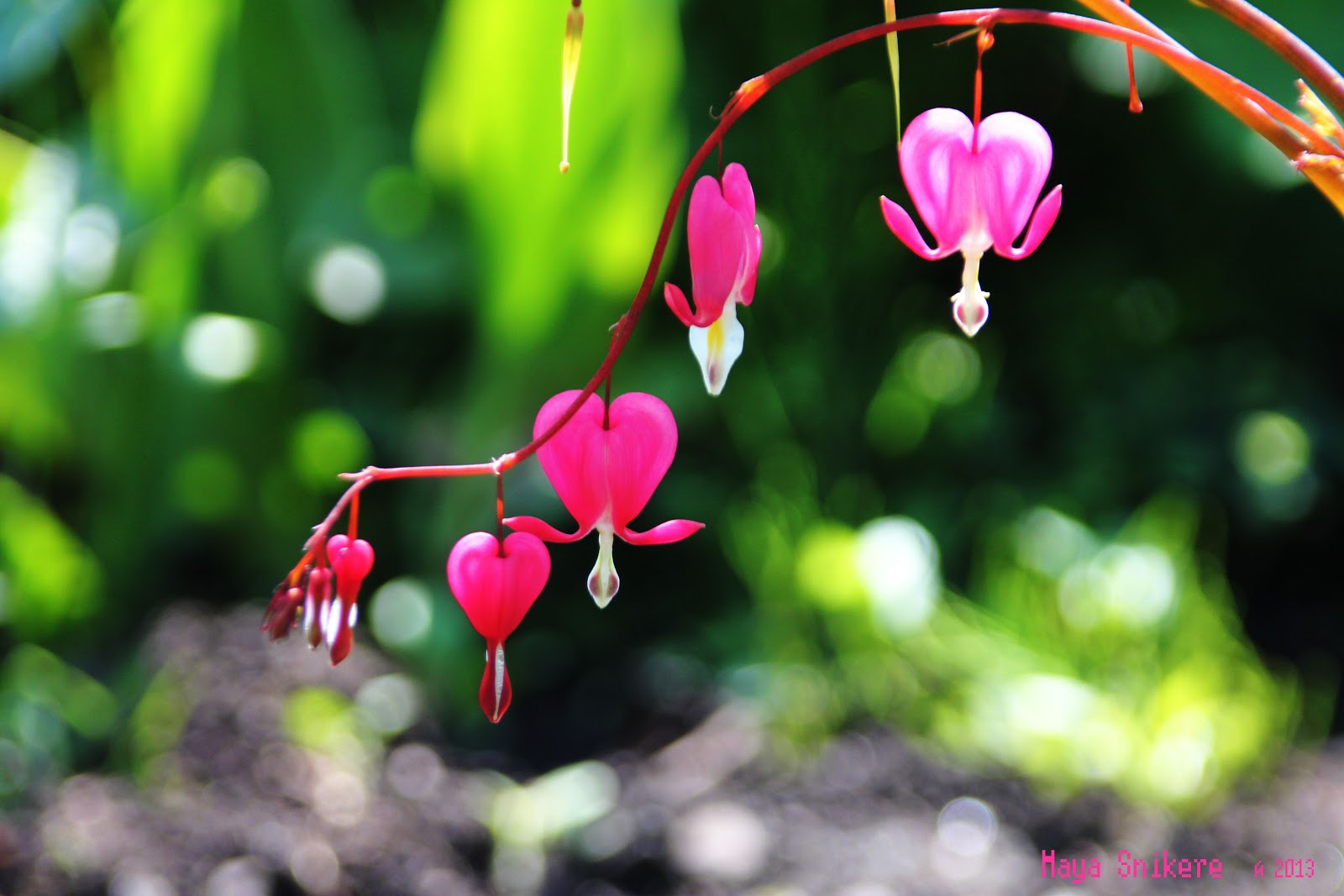
I love how depth of field worked in this one. I changed contrast and using Soft Light Tool in Photoshop made background just a little bit lighter, leaving pink flower as main object in photography.
(above)
I really like composition in this one, but shame that its too blur. I should try to work with tripod maybe, that could help?
(above)
Had the same trouble with this one - not sharp enough!
(above)
I think this is my new favorite image, really like how lights works on this one, depth of field as well.
(above)
I think it would be better if all of purple flowers would be in focus!
My biggest lesson from this shoot - use tripod! So many photos has come out blur!
Chris Enos
Chris Enos has been an artist/photographer for over 40 years. In 1976
she founded the Photographic Resource Center in Boston, Massachusetts.
She now lives and works in Santa Fe, New Mexico.
In this photography its easy to see that she is an artist as well. For me its more abstract than still life image. I like the colors and texture.
She has one style how she is working and its easy to recognize it. She is more about texture and color, than a composition. To be honest I can not say that I'm huge fan of hers, and that's why Im doing research on her, to try argument with myself WHY I don't sympathize her work. Its much more hard to talk objective about someone who you don't like that someone who you love. Its probably mostly of her style, Im fan of details, close-up's and compositions than something like this. For me it just reminds something what been taken with no any plan or idea, just like a random photography. But I would like to try something as this, I assume her photos are planned, and still does looks like perfect composition, and I love how she is playing on color and texture.
In most of here photos flowers are a bit old, and it gives more contrast in photo, like photo above where is this pure white flower and part of it its old and yellow. Old is just different beauty!
Film
A while ago (26 y approx) we had a go shooting with film. It was more exciting than I thought it would be. The hardest/weirdest part was that I could not look at the image straight after it been taken. The biggest issue with this is that I could not check if the light, depth of field and shutter speed worked well, so there is always a chance that half of the photos would come out wrong. But the fact I couldn't see the image made me think more about the composition and made me trust myself and rely more on my intuition. I am happy with the result and would like to do more of film in future, its worth whiting and more exciting than digital.
Edward Weston - Still Life Photgraphy
"one of the most innovative and influential American photographers…"
As Iv done some research for now-day photographers, I wanted to go somewhere where it all started.. and get inspiration from some very first still life photographers!
I find that Edward Weston is still one if the best still life photographers. His working style could be explain with - less is more. His style is very simple if Im aloud to say that, but very genius. He use more close-up's and his photography is more about details.
As he has done loads of female photography, I can understand where he gets his inspiration from. This photography is been famous for making this pepper look like a humans body. Its amazing example for personification. This photography shows that art is everywhere, even if thats just a pepper, you can make it look like masterpiece. This photography is full of shape and its very powerful. No wonder its one the most famous still life photo's ever made.
His critical eye paid off as he quickly gained more recognition for his
work. He won prizes in national competitions, published several more
photographs and wrote articles for magazines such as Photo-Era and American Photography, championing the pictorial style.

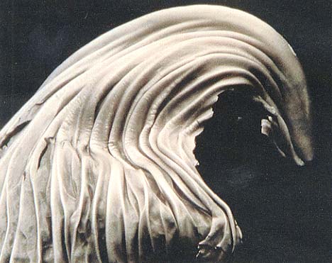
I really like this one. Im amazed how much close-up can do in photography. The form & the texture is making plain cabbage leave to something big and genius. Im looking forward to try something like this. If photography inspires me - that means everything for me.
I admire how much risk he was taking and how different he is from everyone else. He invite whole new style in photography. Simple but genius!!!
Thursday, 30 May 2013
Wednesday, 29 May 2013
eyes
After having idea about something like this, first tried non-digital montage ( I used printed photo of mine, printed photo of eyes(google), glue, scissors & watercolor). I apply a bit watercolour so eyes would blend better with photo). I think it could look better if I would draw those eys as line is very noticeable.
Then I decided to have a go with digital version - Photoshop, to compare those 2 versions of montage.
I once again used the same photo of mine, then found some eyes drawing in google, cutted out using Laso Tool. So eyes would blend with my photography, I used Eraser Tool on different size and % (3-100).
Simples!
It would be better for comparing if I could use the same image of eyes, but I could not find it again. Note - save images what Im planning to use/using!
Im glad about we are having this experimental unit, it makes me be more creative and gives loads of ideas about I would not thought before.
Subscribe to:
Comments (Atom)


