The colours in the top one are a bit over the top, looks a bit false.
Good tones in the second.
The third and fourth are beautiful, as is the sixth.
the fifth needs cropping a bit.
You have a very good range of images some better than others. The ones that work the best are the ones were you slowed down. I like how you have to very different impressions of the same flower in very similar compositions, that is 3 and 6. Well done some really good images - now do some more.
The crop works much better, the bright green leaf was very distracting, it now looks very good in black and white as well. I think that the one that you have used a PS filter on looks amazing! It is so atmospheric and the slightly uneasy lighting really makes you look at the image. I don't normally like these filters because they are often over used, but it works well in this case.
Personally I still don’t like the intensified colours, but I accept that you know you target audience better than I do. Looking at them objectively you are achieving a consistent result, which shows a good degree of ability.
Now all you need to do is to produce better images next time :)
better?! :o to be fair i rarerly think when im doing my photos.. :D i just love to doing them, i think about composition but I just let "emotions" take ower and never had plan one single photo :) will do some flower reserch later and will try to redo some!


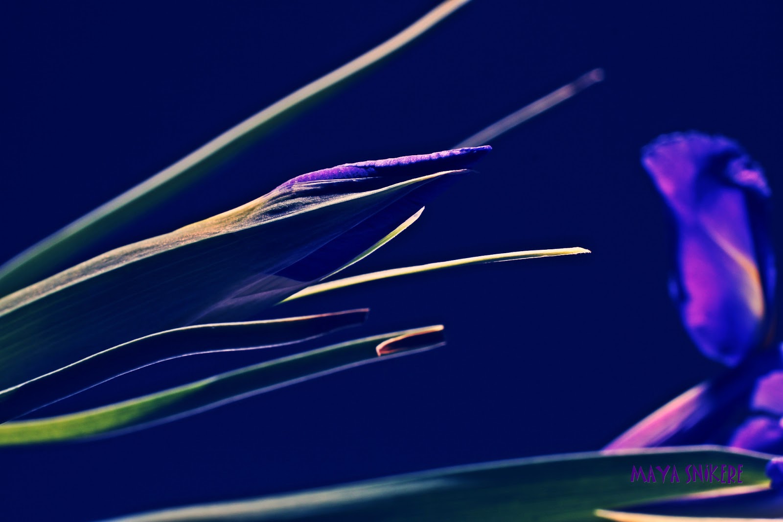
The colours in the top one are a bit over the top, looks a bit false.
ReplyDeleteGood tones in the second.
The third and fourth are beautiful, as is the sixth.
the fifth needs cropping a bit.
You have a very good range of images some better than others. The ones that work the best are the ones were you slowed down. I like how you have to very different impressions of the same flower in very similar compositions, that is 3 and 6. Well done some really good images - now do some more.
First one - colours are too much on purpose, ppl like fake more that natural (mostly)
DeleteWhy it needs cropping?
Thanks :)
Will do later after cleaning :D
The crop works much better, the bright green leaf was very distracting, it now looks very good in black and white as well. I think that the one that you have used a PS filter on looks amazing! It is so atmospheric and the slightly uneasy lighting really makes you look at the image. I don't normally like these filters because they are often over used, but it works well in this case.
ReplyDeletePersonally I still don’t like the intensified colours, but I accept that you know you target audience better than I do. Looking at them objectively you are achieving a consistent result, which shows a good degree of ability.
Now all you need to do is to produce better images next time :)
better?! :o
Deleteto be fair i rarerly think when im doing my photos.. :D i just love to doing them, i think about composition but I just let "emotions" take ower and never had plan one single photo :) will do some flower reserch later and will try to redo some!